“Mainstream economics is replete with ideas that “everyone knows” to be true, but that are actually arrant nonsense.”
Jeremy Rudd. Federal Reserve Board. September 2021.
We don’t often go looking for valuable insights from papers originating out of the Divisions of Research & Statistics and Monetary Affairs of the Board of Governors of the Federal Reserve. However, when an author leads with the above opening line, it will certainly get our attention! We’ve linked in Mr. Rudd’s paper, entitled “Why Do We Think That Inflation Expectations Matter for Inflation? (And Should We?)”, and highly recommend giving it a thorough read.
https://www.federalreserve.gov/econres/feds/files/2021062pap.pdf
Mr. Rudd mentions a few items that (legitimately) fall within his “arrant nonsense” bucket, but the bulk of the paper focuses, as the title states, on inflation expectations. He explains it in the Introduction section thusly; “I argue that using inflation expectations to explain observed inflation dynamics is unnecessary and unsound: unnecessary because an alternative explanation exists that is equally if not more plausible, and unsound because invoking an expectations channel has no compelling theoretical or empirical basis and could potentially result in serious policy errors.”
[As a quick aside, the “has no compelling theoretical or empirical basis” point is one we always raise with central bankers when we have the occasion to discuss the self-anointed 2% price rise mandate (also commonly mis-referenced as “price stability target” or “inflation”). To date, we have only ever had one actual answer, that from a former BOJ official, who explained it as “Bernanke did it, so we felt we had to follow”. Sources, in this case, need to remain confidential.]
As we read through Mr. Rudd’s note, marking it up with margin notes and a highlighter pen, one thing that appeared in the margin scribbles a couple of times was “Goodhart’s Law” https://en.wikipedia.org/wiki/Goodhart%27s_law. For those not familiar, this “Law” originates from renowned economist Charles Goodhart and can be simplified to “when a measure becomes a target, it ceases to be a good measure”.
We felt incredible pride in our intuition when we discovered (with a little direction from the man himself) that Mr. Goodhart did indeed find some affinity with Mr. Rudd’s note, which he quotes at some length in the below linked video of his recent panel at the ECB Forum in Central Banking. His segment kicks off at around the 15:30 mark, but if you have the time, it is worth seeing the other, strongly consensus, side of the argument from his fellow panel members.
https://www.youtube.com/watch?v=w6KQi2tnmIM
Possibly more important than his presentation and quoting of the Rudd piece, is Charles’ response to a question in the Q&A session at the end. At roughly the 54:30 mark, Charles gives the common sensical “sandpile” version of the current set of circumstances. To paraphrase, current high debt levels (public and private) and extreme asset valuations will by necessity constrain central bank’s abilities to utilize monetary policy to fight inflation fully and freely. Charles references a recent article from John Cochrane that, as we have often done, uses a Taylor Rule framework to note that to combat current inflationary levels the Fed would need to adjust the Fed Funds rate to 7.5% and goes on, like Charles, to point out the unrealistic nature of such.
The consensus crowd pushing back against Charles would like us all to believe that unprecedentedly high current ex-post inflation will revert to normal on an ex-ante basis due to the accumulated confidence that the central banks, the ECB in this example, will adjust policy, ie tighten, appropriately to bring it back to where they want it to be. All this expectation, in their inevitable prudence, as they run the most aggressively accommodative policy in their history.
Figure 1: ECB Policy Rate (blue), ECB Wu Xia Shadow Rate (orange), German PPI yoy%

While we are on the topic of central bankers and their understanding of “inflation”, it would seem foolish to not check back in with Chairman Powell. Glancing back on the transcript from the September 2020 post-FOMC press conference https://www.federalreserve.gov/mediacenter/files/FOMCpresconf20200916.pdf, we see their forward looking forecasts for year-on-year % change of the PCE Core Index (what they refer to as “inflation”) coming in at 1.7% for 2021 and gradually rising to 2% by the end of 2023. In response to a question regarding the very slow pace by which “inflation” climbs back towards their target, Chair Powell replies “we think, looking at everything we know about inflation dynamics in the United States and around the world over recent decades, we expect it will take some time”.
Fast forward 12 months, now knowing the truth about inflation dynamics, and we can dive into the September 2021 post-FOMC press conference transcript https://www.federalreserve.gov/mediacenter/files/FOMCpresconf20210922.pdf. We now get a revised forecast for the 2021 “inflation” number, once again revised up from previous forecasts, now standing at 4.2%, fully 2.5% above the forecast from a year ago. Didn’t take much time after all. A few things worth noting, a) the most recent update on PCE Core is as of August 2021 and it came in at 3.6%, b) however, the annualized rate of change over the first 8 months of 2021 is running at 4.79%, meaning it will have to slow down to an annualized pace of about 3.15% to hit the Fed’s latest forecast, c) the equivalent number for CPI (a pricing index that is presumably not “inflation” by their definition) through September 2021 is 5.4%, running at an annualized rate for the first 9 months of 2021 of 6.48%.
Figure 2: US PCE Core Index (red) and CPI Index (white). Normalized.

In addition to the revised 2021 forecast of 4.2%, the great soothsayers also pinpointed their forecasts for “inflation” in 2022, 2.2%, and 2023, 2.1%. Not surprisingly, the inflation related questions this year came from a somewhat different perspective than the ones Chair Powell had to field last year. In particular, one reporter noted that the revised forecasts now have “inflation” above the target rate for the next four years [our note: way above this year], but the policy rate never gets back up to some sort of long run rate, ie the Fed remains accommodative throughout, and enquires how they look at that through the perspective of the average household who are actually seeing real wage declines this year.
His reply: “So, as you can see, the inflation forecasts have moved up a bit in the outyears. And that’s really, I think, a reflection of—and they’ve moved up significantly for this year [our note: 4.2% conservatively forecast for the year]. And that’s, I think, a reflection of the fact that the bottlenecks and shortages that are being—that we’re seeing in the economy have really not begun to abate in a meaningful way yet. So those seem to be going to be with us at least for a few more months and perhaps into next year. So that suggests that inflation’s going to be higher this year, and a number—I guess the inflation rates for next year and 2023 were also marked up, but just by a couple of tenths. Why—those are very modest overshoots. You’re looking at 2.2 and 2.1, you know, two years and three years out. These are very, very—I don’t think that households are going to, you know, notice a couple of tenths of an overshoot [emphasis ours]. This just happens to be people’s forecasts”.
If we were to apply some translation to what we have often dubbed Orwellian speak from Chair Powell, we would simplify that as “let them eat cake”.
This is all a rather lengthy introduction into our theme for this month’s Update which we would broadly define as “The Challenge of Measurement”. We wrote extensively last month on Per Bak’s physics-based principle of Self-Organized Criticality, aka sandpile theory. Not wanting to seem immodest but, if you haven’t already, you should take the time to read it. We think it is an important piece. https://convex-strategies.com/2021/09/22/risk-update-august-2021/
The above central bank gibberish about inflation, ostensibly the most critical negative externality of their efforts to artificially sustain the economic sandpile that they’ve tasked themselves with propping up, is just one of endless examples of the failings of the tools and understandings with measuring risk within complex adaptive systems. We quoted from Per Bak in last month’s Update in relation to how economists view the findings of Benoit Mandelbrot in terms of the power law nature of markets and economies. It warrants another reminder here: “His findings have been largely ignored by economists, probably because they don’t have the faintest clue as to what is going on.”
It is really Mandelbrot’s work, dating back to the 1960s, and detailed in his 2004 book, “The (Mis) Behavior of Markets”, that lays out the shortcomings of the generally accepted theories and models applied to markets and economies today. The truly amazing thing about his work is that nobody really disputes it, yet they carry on disregarding it anyway.
The basic issue could be boiled down in line with what is known at the ‘streetlight effect’. Wikipedia lays it out as thus:
A policeman sees a drunk man searching for something under a streetlight and asks what the drunk has lost. He says he lost his keys and they both look under the streetlight together. After a few minutes the policeman asks if he is sure he lost them here, and the drunk replies, no, and that he lost them in the park. The policeman asks why he is searching here, and the drunk replies, “this is where the light is”
Sandpiles and power laws are complex. Markets and economies behave like sandpiles and follow power laws. And yet, the accumulated knowledge and methodologies follow a fundamentally flawed, simplified model of those worlds, because they have decided it is where the light is. The building blocks of current financial modelling follow a chronology of:
- Bachelier’s “random walk”.
- The normal probability distribution of Gauss.
- Robert Brown’s “Brownian motion”.
- Fama’s “Efficient Market Hypothesis”.
- Modern Portfolio Theory (MPT) of Markowitz.
- Capital Asset Pricing Model (CAPM) from William Sharpe, et al.
- Myron Scholes and Fischer Black’s “Black-Scholes Option Pricing Model”.
- Value at Risk (VaR). Risk Weighted Assets (RWAs).
- BIS Regulatory Guidelines.
- Insurance Solvency Regulations.
Mandelbrot puts it as thus: “The whole edifice hung together – provided you assume Bachelier and his latter-day disciples are correct. Variance and standard deviation are good proxies for risk, as Markowitz posited – provided the bell curve correctly describes how prices move. Sharpe’s beta and cost-of-capital estimates make sense – provided Markowitz is right and, in turn, Bachelier is right. And Black-Scholes is right – again, provided you assume the bell curve is relevant and that prices move continuously”.
And, as they say, there is the rub. Markets and economies do not behave like random walks. Normal probability distributions do not accurately reflect their behaviour. Prices do not move continuously, nor do they behave independently. As we said last month, with sandpiles, history matters.
History is littered with the failures of these dangerously flawed assumptions. One of our own mentor’s, Mark Rubinstein, Portfolio Insurance business in the 1987 stock market crash. Myron Scholes and Robert Merton’s Long Term Capital Management (LTCM) hedge fund in 1998 (just a year after they were awarded Nobel Prizes). Bear Stearns, then Lehman Brothers, then the whole of the global investment banking industry in 2008 under the carefully constructed safeguard of the BIS’s Basel I, II, III regulatory oversight. And still, the same tools rule on. To put it most simply, the attitude of practitioners and regulators, who generally benefit from a lack of skin in the game, is “it works good enough most of the time”. The problem is, it doesn’t work when it matters the most.
More specifically, in our world, what does it mean? Why does it matter? We used the Formula 1 race car analogy last month, coming to the broadly accepted conclusion that the key to winning, even just successfully completing, the 40-lap circuit was having really good brakes. Good brakes allow you to drive faster in the straight sections and navigate safely the tricky bits. Yet at the end of the race, how does one ascribe the contribution of the brakes when the only measures are in terms of speed? Or in our football/soccer analogy, how do you attribute the goalkeeper’s contribution if the singular metric is goals scored? Or in our world of portfolio management, how do you impute the contribution of the protection if language only exists to speak to returns?
The obvious objective for a portfolio would be to optimize return, the numerator, relative to risk, the denominator. Indeed, we can break down “The Challenge of Measurement” into those two components. From there, unfortunately, it immediately gets difficult. Fortunately, we don’t have to deep-dive into Mandlebrot’s concepts of multi-fractal geometry, nor specifically apply the mathematics of more appropriate power law distributions such as Pareto, Cauchy, or Levy. We just need to accept that real world things are sandpiles and provide common sense overrides to counter the failings of the standard tools applied to markets. The answer, as we show over and over, is convexity. In our Formula 1 racer analogy, it is the second order effect of deceleration and acceleration. Speed, in particular steady speed, is easy. Accelerating in the fastest sections, and decelerating in the dangerous parts, is what creates the separation/compounding that determines who wins over the multi-circuit race.
Mandelbrot talks about time and scale. Over what time horizon do we calculate return, the numerator, and do we do so arithmetically or geometrically? For our racer, should we talk about average speed per lap? Or should we talk about terminal time to complete all 40-laps of the race? To jump to a golf analogy, are we playing match play or stroke play? Too often, in the world of investment management, the fiduciaries are playing the game as though average speed per lap, or goals scored per game, or hole-by-hole scoring of match play are the objectives. Thus, the focus is on short term arithmetic returns, and the fiduciary gets to start from scratch on each new lap, each subsequent match, each next tee box. To the end capital owner, however, time is a very different beast. History matters! The end capital owner lives in the world of geometric compounding, where car crashes, goals conceded, triple bogies, and negative compounds carry forward geometrically to the ultimate objective of completing the 40-lap race, wins over the season, stroke-play score over the 72-hole tournament, and terminal capital.
On the other side, the denominator, how do we calculate ex-ante risk when all we have is ex-post information? It is not hard to see that past ex-ante projections, said projections operating under nice bell curve assumptions, are highly prone to disappointing ex-post realizations of highly variable volatility and correlation. As Mandelbrot notes in reference to a study done by his student Eugene Fama, “large changes, of more than five standard deviations from the average, happened two thousand times more often than expected”. In Mandelbrot terminology this would be a scaling issue. The underlying risk is in fact power law in nature and applying a normal probability distribution is outright dangerous. We have for years used our Volatility and Correlation Comet chart to express the two variables that matter the most to portfolios whose risk methodology almost universally assumes them to be stable, safely describing the ex-ante risk of the portfolio. The Comet shows that that is anything but the case.
Figure 3: S&P Volatility and Correlation Comet

While the tools, and indeed language, generally do not necessarily exist to correctly evaluate these issues, there are practical ways to address it. In the simplistic, and wrong, world of modern finance the overwhelmingly standard answer to this is the Sharpe Ratio, and its extrapolation to the “efficient frontier”, which is simply the ratio of the return over the standard deviation (volatility) of the return. We can evaluate the practical efficacy of the Sharpe Ratio with the historical context that, prior to its failure, LTCM had the best Sharpe Ratio of all time, until it was eventually bested by Bernie Madoff. Far too often, that return incorrectly gets snuck in there as short-term arithmetic average return. Anybody caught doing this should be immediately challenged and discredited. A two-year return history of -40% followed by +50% has an arithmetic average return of +5%, but a geometrically compounded return of -5.13%.
Backward looking, ex-post, returns should be as long dated as possible and should always be represented in geometric compounding form. We discuss in some detail the implications of ergodic vs non-ergodic math, and the related issues of ensemble vs time averages in our September 2020 Update https://convex-strategies.com/2020/10/21/risk-update-september-2020/. To the capital owner, rightly targeting terminal capital values, history matters a lot. Safely navigating tight corners, preventing goals, avoiding triple bogies, and cutting off negative compounds is critical.
On the denominator of that equation, in a game determined by compounded capital, in no world is upside volatility a bad thing. So, while using normal distribution standard deviation is a poor measure, we can at least get some improvement by focusing exclusively on downside deviations or downside volatility. The Sharpe Ratio equivalent measured against downside volatility is known as the Sortino Ratio. Still far from perfect, but for ex-post evaluation of portfolio performance, using Compounded Annual Growth Rate (CAGR) over a sufficiently long period as the numerator and downside deviation of the denominator, we at least get something better.
The below grid sorts various strategies by Sortino Ratios, calculated simply as the CAGR/DownVol. Also in the chart is another useful measure of ex-post risk, Peak-to-Trough drawdown. These numbers are generated on monthly performance numbers from January 2005 – September 2021. The two customized portfolios at the bottom (ie. the two highest Sortino Ratios, just saying) are sample, positively convex, portfolios that we regularly use to show the value of convexity in a portfolio. The Dream Portfolio is 60% SPXT/20% Gold/40% CBOE Eurekahedge Long Vol (LongVol) Index. The Always Good Weather Portfolio (AGW) is 40% SPXT/40% XNDX/40% LongVol.
Figure 4: Performance Grid Jan 2005-Sept 2021. Sorted by Sortino.

It is easy enough from here to standardize risk across either of the two risk parameters, Peak to Trough or Down Vol. In the below grid we have standardized various components by downside deviation, or Down Vol as it is labelled. In order to equalize Down Vol risk, we have allocated to Cash (the SHY ETF of short dated US Treasury instruments) in the event that we needed to pull Down Vol lower, or have allocated to SPXT (SPX total return index) in the event we needed to push Down Vol higher. We have standardized the Down Vol to 6.7%, the downside deviation risk of a 0.6 Beta benchmark (60% SPXT, 40% Cash), a not uncommon benchmark for institutional investors. Once standardized for risk, the high Sortino Ratio strategies are the clear winners in the race to Terminal Capital. The subsequent bar chart couldn’t make it any clearer.
Figure 5: Performance Grid Jan 2005-Sept2021. Standardized to Down Vol. Sorted by Terminal Capital.

Figure 6: Terminal Capital and CAGR of Risk Equalized Investment Portfolios

The difference between these strategies is the difference between actual risk mitigation, something that allows you to take more risk, versus risk reduction, something that is just taking money out of the game. Good risk mitigation adds convexity to a portfolio and allows increased risk taking. Good brakes allow for superior deceleration coming into an unforeseen corner and superior acceleration coming out of it. Everything else is merely reducing the speed in hopes that you drive the car slowly enough such that, within the flawed normal distribution statistic, you don’t crash on any turns sharper than your 95%tile expectation window.
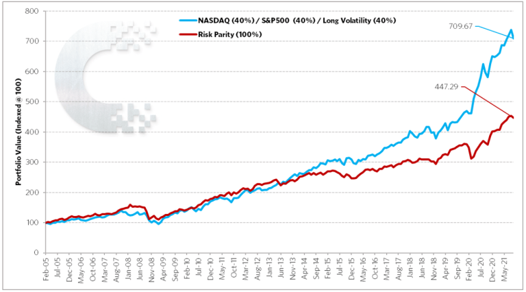
We can reprise our two race car examples from last month’s note. The risk mitigating, convex, Mandelbrot resilient, Barbell Racer represented by the Always Good Weather Portfolio, versus the risk reducing, concave, random walk inspired Balanced Racer represented by the S%P Risk Parity (10%vol) Index.
Figure 7: Barbell Racer (blue) vs Balanced Racer (red). Scattergram. Jan2005-Sept2021

Figure 8: Barbell Racer (blue) vs Balanced Racer (red). Compounded Path. Jan2005-Sept2021
The above, once again, makes it very clear. We can see in the Scattergram that the Balanced Racer, that has calibrated its speed to optimize to the probabilistic risk of turns inside the 2-standard deviation 95%tile normal distribution, does just that. It performs well around the mean and in the turns that are well predicted by the flawed use of normal distribution probability statistics. The trade-off, for optimizing to performance around the mean and a simplified measure of risk, is foregone upside performance (acceleration) and a lack of concern that your risk methodology doesn’t protect well (deceleration) in those sharp corners that inevitably and unexpectedly show up in a power law distributed race circuit. As Per Bak so aptly puts it, “Because of the power law statistics, most of the topplings are associated with the large avalanches. The much more frequent small avalanches do not add up to much”. The end result, the Barbell Racer, with superior deceleration and acceleration (ie. convexity), eventually pulls away. Its superior risk mitigation (brakes) allows it to benefit from the unexpectedly sharp turns, thus letting it accelerate much more aggressively in the faster sections. It isn’t foregoing power to reduce risk. It is mitigating risk to increase power.
Below we show the same again but for the risk equalized version, per the above bar chart, adjusted for equivalent downside deviations. It just accentuates the same story. Driving more slowly, without brakes, as a means to reduce risk, is no way to compound in a long-term race.
Figure 9: Barbell Racer (blue) vs Balanced Racer (red) – Risk Equalized. Scattergram. Jan2005-Sept2021

Figure 10: Barbell Racer (blue) vs Balanced Racer (red) – Risk Equalized. Compounded Path. Jan2005-Sept2021

Over the years, we have shown it in many ways.
Figure 11: SPX Index Compounded Path (grey). Less 10 Worst Months (blue). Less 10 Best Months (red).

If your strategy is cutting off the 2%tile worst months and participating in everything else, you can get on the blue line. If your strategy is missing out on the 2%tile best months, but catching all the rest, you are stuck on the red line (ie. strategies that forego upside due to ineffective risk reduction as opposed to effective risk mitigation). This is just the pure math version of what we showed with the above examples. The double whammy of the fat-tail power law scaling dynamic, also known as left-skewed or kurtosis, and the simple non-ergodic math of geometric compounding, leads to this phenomenon. Nothing is more important than the brakes! From the above, we generate the below breakdown.
Figure 12: Contribution to SPX Index Long Term CAGR. Top 2%tile (blue), Mid 96%tile (grey), Bottom 2% (orange)

Anybody blindly following the mathematics of the Random Walk crowd, is targeting the Mid 96%tile of the above numbers, which, to put it bluntly, is the part that doesn’t matter. The regularly occurring, small avalanches, don’t make a difference.
We’ve shown that, despite the flawed tools of modern finance, we can still find work arounds to hint at the value of brakes/goalkeepers/risk mitigation on an ex-post performance basis. What we can’t know, from just historical performance data, is how good the protection really could have been ex-post if the curve hadn’t straightened out when it did. Which Balanced Racers would have eventually crashed out of the race if the curve had gotten even sharper? Were the brakes of the Barbell Racer strong enough to have withstood even greater need for deceleration? Even more important, looking forward ex-ante, how do we know our risk if we are still using the tools of normal distribution probabilities. Again, the proper maths behind these issues are complex and really not catered to in the toolkit of finance today, but the good news is we can apply another very practical work around.
This gets into the concept of “risk heuristics”, as coined by Nassim Taleb, and the very practical implication of pay-out functions. We wrote on the premise of ‘x’ vs ‘f(x)’ back in our May 2021 Update https://convex-strategies.com/2021/06/17/risk-update-may-2021/. The truly fantastic news is, we don’t have to bother ourselves with all the flaws behind predicting and forecasting the outcomes and risks of ‘x’, the underlying market. All we must do is manage our own particular pay-out function, ‘f(x)’. On a practical basis, this comes down to stress testing. Not stress testing on some historical what happened before, or on some hypothetical made up scenario, but proper stress testing. You can call it reverse stress testing, if you like, but the concept is figuring out what hurts, where your exposures have bad pay-out functions. Risk isn’t what you think is going to happen. Risk is what hurts IF it happens.
This is how you can measure the contribution of your brakes/goalkeeper/protection. Run a consistent standard risk heuristic and keep track of it over time. Shock volatility and correlation to extremes and find out what your exposure is to those variables. Then structure the convexity in your portfolio based on what you don’t know, not what you think you know. Well structured, positively convex, negatively correlating, highly asymmetric protection strategies will show their value in well structured risk heuristics. Once the flawed risk measure of the fat left tail, negative skew, downside kurtosis is solved, the decision about adding more acceleration to the car becomes a no-brainer.
The below simple representation, from our April 2021 Update https://convex-strategies.com/2021/05/21/risk-update-april-2021/, uses the concept of Shannon’s Entropy to provide a very useful visual. The simple bell curve distribution is the building-block that is being used to evaluate expectations of ‘x’, and onward to the flawed simplistic standardized risk methodologies of the financial industry. The blue line, Entropy, represents the value impact of the uncertainty and chaos that results in the wings, the ‘f(x)’ where it matters. We leave readers to ponder for themselves the likely impact on “value”, in a world that prices based upon the probability-based assumptions of the orange line distribution, the things whose value is represented by the arc of the blue line. Portfolio construction efforts need to focus on the blue line, that’s how compounding is delivered.
Figure 13: Entropy vs Binomial Probability Distribution

Just one final visual, going back to our favourite football/soccer analogy. In the below you could imagine the overlaid probability distribution as representing the time the match takes place in the underlying portion of the pitch. On average, the game’s activity occurs near the centre of the pitch, widening out in nice standard deviations from there. If what we care about is games won, it is the ‘f(x)’ that matters, goals for and against, the action almost entirely takes place, as we’ve drawn it, outside of 3-standard deviations. Like with our above Entropy view, everything that matters takes place inside the two penalty boxes…..where a goalkeeper can be handy!
Figure 14: “Participate and Protect”

Read our Disclaimer by clicking here