Our June 2021 Update https://convex-strategies.com/2021/07/23/risk-update-june-2021/ led off with what must surely be dubbed the “Quote of the Year”:
“The Fed says it will no longer react to anticipated higher inflation but only to actual higher inflation. Yet they are failing to react to actual higher inflation because they anticipate it will decline. Perhaps the real framework is anything that justifies not tightening?” Bill White; Financial Times, June 28, 2021.
If you thought that Bill’s quote rang true back in June, you’d be ready to carve it in stone after what we saw in the tussle between central banks and the interest rate markets over the last month.
The credibility of central banks was most notably discarded this month in Australia where the market brushed aside the RBA’s Yield Curve Control (YCC) commitment to keep the yield, on what is now roughly a 2.5yr bond, below 0.10%, in line with their existing policy rate and their “forward guidance” of not tightening rates until 2024. By October 22nd the yield on their YCC target bond had drifted through their 0.10% ceiling to circa 0.17% and, eventually, the RBA responded by jumping in with an A$1bn purchase of bonds, pushing the yield back down to roughly 0.11%. That bazooka only calmed the market briefly, as fears, then realizations, of higher-than-expected CPI numbers came to fruition. After the CPI print on Oct. 27th, in particular the now preferred “Trimmed Mean” version, the questioning of the RBA’s commitment accelerated. Over the next couple of days, it became clear that the RBA deemed it no longer worthwhile to waste any more of their printed currency units defending this bond as the yield spiked to 0.80%. Generously, they did get around to announcing what everybody already knew, at their Nov. 2nd policy meeting, that their dabble into YCC was officially over.
Figure 1: Australia Govt Bond 04/24 Yield (white) and RBA Policy Rate (red)

This article in the Australian Financial Review sums it up all rather nicely – https://www.afr.com/policy/economy/rba-must-give-up-predicting-the-future-20211101-p5951v.
The above image is not totally uncommon in the world of central bank interventions into market pricing. Take for example the value of the CHF relative to EUR which for some time the Suisse National Bank capped at 0.8333 (or equivalently floored at EUR/CHF 1.20). That all came to a sudden end in Jan 2015 when, to their credit relative to the RBA, they announced it was no more THEN stopped defending the level.
Figure 2: CHF/EUR FX Rate (white) and SNB Cap (red)

Another similar visual is the USD Libor – OIS spread from back in Aug 2007.
Figure 3: USD Libor – OIS Spread

It is not difficult to find these sorts of examples, one way or another, that all artificially sustained sandpiles eventually end up this way. We discuss sandpiles in some depth back in our August 2021 Update https://convex-strategies.com/2021/10/19/risk-update-september-2021/. The purveyors of such outcomes would like us all to be aware that their intentions were good. As we have said before, in their ex-post excuses, “the intentions justify the ends”. They have a remarkable ability to assure us that their precision handling of all the knobs and dials will smoothly guide this incredibly complex system to the desired future outcomes, and yet claim no impact of their past actions on the current circumstances. To them, the past evolves with a total randomness, a series of unforeseeable exogeneous shocks. The future, however, is perfectly within their control. It would be laughable if it weren’t so cruel.
We most often focus on the Federal Reserve when pointing out these flaws/misrepresentations by central banking officials. There is a case to be made, however, that the ECB has set themselves apart as an even grander example of this tomfoolery, thus finding themselves with an even more fragile sandpile. The concerns around central bank policy sustainability, that originated in Australia, eventually found their way to Europe. While the scale of adjustment in the actual front end of the rate market was nowhere near the scale that was seen in Australia, the impact on the unprecedentedly compressed front end of the EUR interest rate volatility market was quite impressive.
Figure 4: EUR 2y Swap (white) and AUD 2y Swap (blue)

Figure 5: EUR 1y1y Swaption Implied Volatility. Short Term View

The absolute level of the implied volatility may look outrageous, but one doesn’t have to drag the start date back all that far to see otherwise. The extended period of unnaturally low volatility from 2014 to 2021 would be held up as a sign of the success of the ECB’s sandpile sustaining policies. The uncontrollable spike of volatility in the last week of October would be deemed as unforeseeable.
Figure 6: EUR 1y1y Swaption Implied Volatility. Long Term View

The ECB held their regular policy meeting on Oct. 28th and announced no change to their policy stance. ECB President Lagarde, in the subsequent press conference, responded to questions about the markets bringing forward implied pricing of future rate hikes with the below.
“Our analysis certainly does not support that the conditions of our forward guidance are satisfied at the time of lift-off as expected by markets, nor anytime soon thereafter.”
In other words, the ECB does not agree with the market expectations of inflation, the “condition” that seems relevant from a market perspective. Ms. Lagarde went so far as to stress the conviction around their own forecasts.
“We really looked and very deeply tested our analysis of the drivers of inflation, and we are confident that our anticipation and our analysis is actually correct.”
How could anybody doubt their analysis after they “very deeply tested” it and are confident it is “actually correct”? Their current official forecasts (last updated in Sept. 2021) for their own price stability measure (HICP, aka “inflation”) are: 2.2% for 2021, 1.7% for 2022, and 1.5% for 2023. A year previous, in Sept 2020, they had forecast 2021 to come in at 0.8%.
One needs to be a bit careful with these numbers as the ECB appears to go to every length to misrepresent. These numbers do not represent the inflation over the course of the year in question, ie Jan 1, 2021 thru Dec 31, 2021, but rather the rolling average of the monthly y-o-y% changes over the stated year. As of when this latest forecast was produced, after the reported numbers for Aug 2021, it implies a forecast for year-end 2021 inflation of 3.1%. We show below with the red-dashed line the projected path of their price index to that assumed year-end forecast.
Figure 7: Eurozone HICP Index thru Aug. 2021 (white) and ECB year-end Projected Forecast (red)

We have since seen the reported HICP price updates for Sept and Oct 2021 and show the up-to-date chart below, leaving in the red-dashed line from end of August to the year-end forecast level. The most recent update for the y-o-y% change for Oct 2021 came in at 4.1%, taking the 2021 year-to-date annualized rate of change to 4.88%. The chances of hitting the ECB’s forecast of 3.1% (which is what it would have taken to achieve their average monthly y-o-y% change forecast of 2.2%) seems increasingly unlikely.
Figure 8: Eurozone HICP Index thru Oct. 2021(white) and ECB year-end Projected Forecast (red)

Even without firing up any complex econometric dynamic stochastic general equilibrium models, we can take a stab at forecasting 2021 total year HICP increase by simply using the 10 out of 12 monthly data points already in our possession. Below we show two non-complex model-based forecasts, one based on the remaining two months progressing at the average of the monthly change over the previous 12 months, 0.40%, and the other projecting the rate of change for the remaining two months running at the rate of the most recent month, 0.80%. Not overly sophisticated, but we suspect slightly more accurate than the current forecast from the ECB.
Figure 9: Eurozone HICP Index thru Oct. 2021(white), ECB year-end Projected Forecast (red), year-end Projected Forecast at YTD average mom% change 0.4% (green), year-end Projected Forecast at Oct mom% change 0.8% (purple)

We, of course, are not applying any expertise garnered from Economic PHDs in our two revised forecasts, just doing some fairly simple math. Still, despite the reams of PHDs at the disposal of the ECB, it strikes us that their ability to project the year-end inflation number, when they were already in possession of 8 out of the 12 monthly data points, leaves something to be desired. It begs the question, are they terribly poor forecasters, or should we simply assume it is all a blind attempt at manipulation? It makes us wonder what is worse – that the market thinks that their forecasts are just wrong, or that the market thinks their forecasts are intentionally meant to be misleading?
And yet, we remind you, Ms. Lagarde claims “We really looked and very deeply tested our analysis of the drivers of inflation, and we are confident that our anticipation and our analysis is actually correct”.
Apparently, despite how the current periods will feed through into their average monthly rate over the first half and more of next year, she wants us to believe that there is some intellectual legitimacy to their silly average monthly y-o-y% change forecasts for 2022 of 1.7% and 2023 of 1.5%.
At least temporarily, in the last several days of Oct 2021, the market decided it might be time to reflect some sense of reality. Below is a nice simple visualization of what some could argue represents some aspect of reality. Using the two commonly stated policy targets of Unemployment Rate and Price Stability Measure compared to central bank policy rate and a market interest rate represented by 2yr swap rates. It gives some possible explanation as to why the market might think interest rates should go higher and that the artificial suppression of both their level and their volatility is likely doomed.
Figure 10: Eurozone Unemployment Rate (green, LHS inverted) and HICP y-o-y% change (purple) against ECB Policy Rate (red) and EUR 2yr Swap Rate (white)

Again, if the green and purple lines represent relevant indicators on policy setters’ dashboards, they have either lost the plot or they are being disingenuous about what their actual policy objectives are.
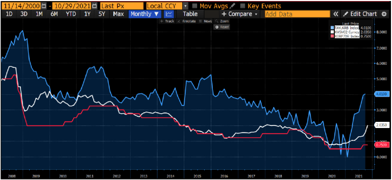
Another way to look at it is to use our old comparison of a Taylor Rule policy rate estimate, as a proxy for economic circumstance, and a Wu Xia Shadow Rate as a proxy for the policy setting adjusted for the impact of QE.
Figure 11: ECB Policy Rate (red). EUR 2yr Swap Rate (white). Eurozone Taylor Rule Estimate (blue). Eurozone Wu Xia Shadow Rate (orange)

Given those perspectives, it is not difficult to see why the market, given any doubt of the sustained unwavering intervention by the ECB, might rather quickly choose to reduce exposures that may be harmed by a realignment of the white line to a free-market sort of rate. Thus, the reaction to the price of volatility we noted above. In our sandpile analogy, we would, with some confidence, designate this as a “finger of instability”.
The amazing thing is that Ms. Lagarde and her cohorts continue to assure all that the unexpected loss of control over their price stability measure will, very shortly and with great certainty, return back below their minimum price rise target. This despite them running the most aggressively inflationary policy mix ever in their history. They are literally telling us, with ex-post inflation realizing at 30-year highs, that their all-time maximally inflationary stimulating policies, absolutely guaranteed, WILL NOT WORK! That out of control inflation, without any adjustment to their all-out inflation generating policies, will come back down below their long run target as soon as next year. Which, again, really begs the question, what is the point of their policies? If they believe their policies “work”, they should stop them right now and align policy settings to current economic circumstance. If they believe their policies do not work, as is indicated by their nonsensical forecasts (terminological inexactitudes?), they should end their policies right now and start explaining what the point of them was all along.
That simple analysis to help identify a “finger of instability” in the global economic sandpile, can likewise be applied to possibly aid in identifying the all-important “connectivity” in the global risk sandpile. We began with Australia and can create similar visuals on economic circumstance and policy vs market settings there.
Figure 12: Australia Unemployment Rate (green, LHS inverted) and Australia CPI y-o-y% change (purple) vs RBA Policy Rate (red) and AUD 2yr Swap Rate (white)

Figure 13: RBA Policy Rate (red). AUD 2yr Swap Rate (white). Australia Taylor Rule Estimate (blue)

Not hard to see why the market decided to rebalance risk a bit once the RBA’s unwavering commitment, to their artificially imposed rate level, seemed to waver. As we said in our August Update as regards Afghanistan at the time, “Why would the US do something that would end up allowing the Taliban to overtake the entire country? Presumably because they decided to.” Likewise, why would central banks let interest rates rise? Presumably because they decided to. The RBA “decided” to no longer impose their ceiling on the yield of the YCC target bond and rates went up. Oh, and just like President Biden in his July 8th speech vowed to never again send American troops back into Afghanistan knowing that it would inevitably end with the same results, so too has RBA suggested they won’t be using Yield Curve Control as part of their policy toolkit in the future.
We can scroll through one after another. Here is Korea.
Figure 14: Korea Unemployment Rate (green, LHS inverted) and Korea CPI y-o-y% change (purple) vs BOK Policy Rate (red) and KRW 2yr Swap Rate (white)

Figure 15: BOK Policy Rate (red). KRW 2yr Swap Rate (white). Korea Taylor Rule Estimate (blue)
The UK is a particularly eyepopping example. Making it especially shocking when BOE Governor Bailey went full reverse, with zero notice, on his previous clear guidance that they would commence rate hikes at their most recent meeting, likely surpassing his predecessor’s (Mark Carney) post Brexit rate cut as the dumbest policy decision in modern BOE history. Governor Bailey did, to his credit, say that he was “very sorry” about the “bites” on people’s household income (https://www.bbc.com/news/business-59173293) as he maintained policy settings targeted at juicing inflation as much as ever in BOE’s history. Again, he portrays with absolute certitude that his maximally inflation generating policy settings WILL NOT WORK and their measures of price stability will imminently collapse back precisely to their target.
Figure 16: UK CPI y-o-y% change and Forecast

Figure 17: UK Unemployment Rate (green, LHS inverted), UK CPI y-o-y% change (purple) and UK RPI y-o-y% change (blue) vs BOE Policy Rate (red) and GBP 2yr Swap Rate (white)

Figure 18: BOE Policy Rate (red). GBP 2yr Swap Rate (white). UK Taylor Rule Estimate (blue). UK Wu Xia Shadow Rate (orange)

Then, of course, there are the keepers of the global reserve currency in the US, where Oct 2021 CPI just printed a y-o-y% change of a whopping 6.2%. Most will be aware that the changing economic circumstances have, at long last, seen an adjustment in Fed policy settings. As of this month they will reduce the amount of QE security buying from $120bn per month down to $105bn, with an expectation to continue to reduce the amount of purchases each month by an additional $15bn, aka “tapering”. They anticipate ending their monthly purchases around about June 2022, at which point they will presumably make decisions about what to do with their circa $9tn stock of assets, as well as the 0% setting for the Fed Funds Rate.
Figure 19: US Unemployment Rate (green, LHS inverted), US PCE Core y-o-y% change (purple) and US CPI y-o-y% change (blue) vs Fed Funds Policy Rate (red) and USD 2yr Swap Rate (white)

Figure 20: Fed Funds Policy Rate (red). USD 2yr Swap Rate (white). US Taylor Rule Estimate (blue). US Wu Xia Shadow Rate (orange)

And you wonder why markets seem inclined to reprice interest rates? In the world that ZIRP, QE, and an absolutist belief in the “Fed Put” has created what we like to call “one big LTCM”, is it any wonder that the smallest of dislocations, in the financial world’s most impactful “Peg” ever, result in immediate issues around uncapitalized tail events?
It is hard to argue, in terms of sandpile analogies, that we aren’t at some sort of extremes of fragility. The scale of effort by central banks and governments to prop up the unsustainable are truly extraordinary. To reprise our Afghanistan analogy, it has been never-ending rounds of ever larger troop surges, one after another. Another simple visual of how unprecedented the circumstances that these efforts have led us to is a simple proxy of real interest rates. The below is just the yield on the US 10yr Treasury Bond minus the y-o-y% change of the CPI Index. As we have highlighted in the chart, the last time we saw something this extreme, Paul Volcker got appointed as Chair of the Federal Reserve. It is worth noting, when Volcker took over and commenced his cage-match with inflation, the 10yr bond yield was already circa 9% and total public and private debt to GDP was a mere pittance compared to what we have today. In other word, we would argue, the sandpile is far more risk today.
Figure 21: US 10yr Treasury Bond Yield and CPI Index y-o-y% change.

Time will tell at what point the powers-that-be decide that the destructive societal implications of the multi-decade experiment of money and credit generation (true inflation) outweigh the imperative to hold back the flood of solvency risk. As we have said over and over again: why would they let interest rates go up? Because they decide to.
From a risk and portfolio management perspective however, this all leaves us right where we have always been. Participate and protect. Participate and protect. Participate and protect. If portions of your portfolio aren’t targeting those two things, why are you tying up capital in them? Given the state of nominal yields, and more so real yields, that raises serious questions about the role of fixed income in portfolios. Even more questionable is the role of levered carry, short vol, and, maybe worst of all, absolute return hedge fund strategies. It really has to be increasingly difficult for allocators to justify placing capital, presumably in the name of “diversification”, into negatively convex, positively correlated, active managed strategies where the investor gives away a significant portion of the upside (in the form of performance linked fees) while getting delivered 100% of the downside. That is so obviously a disaster for compounding returns that it must clearly disclose that said allocators are not targeting compounded returns. For those who actually do want to compound returns, we would advise looking for strategies where the investor gets to keep the upside of the correlated risks they are taking, and their advisors/managers are paid to mitigate the downside with efficient negatively correlated protection. That’s how to compound, we believe.
In last month’s Update https://convex-strategies.com/2021/10/19/risk-update-september-2021/ we created these risk-equalized views of various portfolio diversifying strategies.
Figure 22: Performance Grid Jan 2005-Sept2021. Standardized to Downside Vol. Sorted by Terminal Capital.

Figure 23: Terminal Capital and CAGR of Risk Equalized Investment Portfolios

We can fire up our Scattergram tool and give a clear visualization of how these risk-equalized strategies have behaved over the more current time-period, in these examples Jan2020-Oct2021, relative to our neutral 0.60 beta benchmark.
Figure 24: 0.60x S&P (blue) vs 80% HFRX Hedge Fund Index + 20% S&P (red)

Figure 25: 0.60x S&P (blue) vs 55% PUT Put Write Index Index + 45% Cash (red)

Figure 26: 0.60x S&P (blue) vs 65% Bloomberg US Corp High Yield Index + 35% Cash (red)

Figure 27: 0.60x S&P (blue) vs 63% Endowment Index + 37% Cash (red)

Figure 28: 0.60x S&P (blue) vs 68% HFRI Hedge Fund of Fund Index + 32% S&P (red)

Figure 29: 0.60x S&P (blue) vs 62% Risk Parity 10v Index + 38% Cash (red)

As far as the above “Red Strategies” go, as we have so often noted, they are all just barely different versions of the same thing. They neither participate with acceleration, nor protect with deceleration. To the naked eye, they all start to take the shape of a short put strategy. The end investor is giving away upside but getting his full share of downside. The “Red Strategies” all have the same dynamics of having a fat-tailed, negatively skewed, return distribution. We can flip the colours around, making the 0.60x Beta benchmark red, and load in our various positively convex “Blue Strategies”.
Figure 30: Barbell 80% S&P + 40% CBOE Long Vol (blue) vs 0.60x S&P (red)

Figure 31: Dream (adjusted) 70% S&P + 20% Gold + 40% CBOE Long Vol (blue) vs 0.60x S&P (red)

Figure 32: 60% TRPEI Index + 40% CBOE Long Vol (blue) vs 0.60x S&P (red)

Figure 33: Always Good Weather (adjusted) 45% S&P + 40% NDX + 40% CBOE Long Vol (blue) vs 0.60x S&P (red)

There really is no argument, though you wouldn’t know it by the behaviour of the bulk of the fiduciary investment world. To give further perspective, we can throw together these risk-adjusted versions of our previous Formula 1 analogy – the Barbell Racer, aka Always Good Weather (AGW), versus the Balanced Racer, aka Risk Parity.
Figure 34: Adjusted Barbell Racer (AGW) vs Balanced Racer (Risk Parity). Scattergram and Compounding.
Always Good Weather (adjusted) 45% S&P + 40% NDX + 40% CBOE Long Vol (blue) vs 62% Risk Parity 10v Index + 38% Cash (red)

The Balanced Racer lacks good brakes! That impedes its ability to accelerate in the fast parts of the track and decelerate into dangerous curves. Under what scenario can the Balanced Racer make up the gap when the Barbell Racer extends its lead in all the most important sections of the racetrack? If this has indeed been the case, looking back over years and decades of the critical delivery of the central bank reaction function of ever lower interest rates, how does it look going forward from here with the economic sandpiles these mad scientists have manipulated to this point? If anybody can think of something that will have a bigger impact on the future compounding of an investment portfolio than improved convexity, we would love to hear about it.
Read our Disclaimer by clicking here