One of our old sayings, dating back to pre-Asian Crisis days, is that when you have positively convex portfolio construction, “more risk is less risk”. We can put this many ways. It is not the forecast, but rather the payout that matters. It is not “x”, the uncontrollable outcome of the underlying, but rather f(x), your exposure to the outcome, that matters and that you can control.
Back in our December 2020 update (https://convex-strategies.com/2021/01/22/risk-update-december-2020/) , we touched on this concept and used Jensen’s Inequality to visualize the differing payout functions of a Volatility Swap versus a Variance Swap.
Figure 1: Jensen’s Inequality (Var vs Vol)
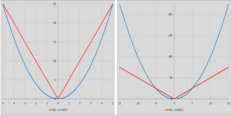
Source: Convex Strategies
The concept of “x vs f(x)” pretty much undergirds all that we do, all that we think about. It is the basic premise by which we believe risks and portfolios should be managed. It is the underlying theme to our criticisms of policy makers, particularly where f(x) extends beyond first order effects. Maybe most significantly, it describes the key structural flaw of the financial system, where the key participants – almost exclusively fiduciaries – are allowed to operate under regulatory risk and accounting guidelines, structured around flawed mathematics of probability distributions of “x”, while all but ignoring the implications of f(x). This “flaw” leads to the proliferation of what we commonly refer to as “uncapitalized tails”.
We thought we could look at some hypothetical examples where the “x vs f(x)” dichotomy might recently have come into play.
For the first example, we will define as “x” the share price of Viacom, and as f(x) the Profit and Loss (P&L) of a $1bn investment and initial price of $100 per share. In market lingo some might call this a Delta One exposure, just a plain old purchase of shares, with a linear P&L exposure to the price.
Figure 2: Delta One Payout in Viacom

Source: Convex Strategies
We suspect most people think of this as the nature of risk of most investments in a stock. In today’s world, however, that is not necessarily the case. For the next example, “x” stays the same but f(x) now becomes the payout function of a hypothetical Family Office that was able to place the $1bn as margin and enter into a derivative agreement with a Swap Counterparty on a notional exposure of $5bn. For this next example, we have assumed that the Swap Counterparty is charging a 1% funding cost for the assumed leverage on the swap structure.
Figure 3: Long Levered Swap Payout in Viacom

Source: Convex Strategies
Now, at what would be termed as 5x levered, the hypothetical investor in this example would lose their $1bn, this time put up as margin to the Swap Counterparty, once the share price drops to just $80, but should the share price double to $200 their profit would be $5bn, less the 1% funding cost. In theory, should the share price go down below $80, even all the way to zero, their loss could be floored at the $1bn that they put up as margin, assuming they are willing to accept whatever repercussions would come with failing to meet their swap obligations beyond what was covered by the margin, e.g. going into bankruptcy protection.
The final worked example, obviously, must be the Swap Counterparty’s hypothetical payout function. This player is making the 1% leverage charge, has protection from loss of the $1bn margin put up by the investor against the swap, and has (we are assuming) purchased the $5bn worth of stock at $100 as the hedge against their swap obligation. Their payout function would look like this.
Figure 4: Swap Counterparty Levered Swap Payout on Viacom

Source: Convex Strategies
With Viacom’s share price above $80 (x > 80), the Swap Counterparty makes $40m (we’ve assumed a 1% funding charge on the $4bn they needed to borrow to buy the $5bn against their swap exposure). Then, should they lose the margin, they would ride the position down as if it is their own from there. Maximum downside is $4bn, but presumably, just as soon as the investor fails on the first margin call, they will be liquidating the position as quickly as possible.
We can use some fairly recent price action in Viacom and extend our hypothetical example and observe some theoretical results. We will assume a swap agreement was structured on March 22nd when Viacom was trading around our $100 starting point. The next day the price closes at circa $91. No big deal, the hypothetical $1bn/20% margin put up by the investor still covers the potential risk to the Swap Counterparty. On March 24th, however, the price closes at $70. Alarms go off and a margin call is likely sent from the Swap Counterparty to the investor to top up their margin to the tune of at least another $1bn. On the next day, March 25th, things are fairly calm as the Swap Counterparty anticipates normal behaviour from the investor, with an expectation that the revised margin payment will be posted. By the end of the day, in our hypothetical example, the Swap Counterparty notes that the fresh funds have not arrived. Matters likely deteriorate from here as the demands for the margin escalate from email to phone calls, and by ever higher levels of personnel, to the point that by the morning of 26th March, when still no new margin has been posted, the Swap Counterparty has little option but to threaten to liquidate the position. We will assume that this happens and now the position belongs to the Swap Counterparty, less the original $1bn of margin, and they commence their liquidation trying to avoid carrying the whole thing down to zero.
Figure 5: Viacom Share Price

Source: Bloomberg
We can combine our payout views into one picture and see what happens for the hypothetical participants on the 5-day collapse from $100 to $40. We have left in the payout function for the Delta One exposure to give some perspective of the differing f(x) between how risk looks for a traditional investment versus how it looks once the moral hazard driven, regulated financial sector, gets involved. In our hypothetical example, if we assume that the Swap Counterparty closed out their position around the lows of the day on March 26th, the end outcomes are a $1bn loss for the investor and a $2bn loss for the Swap Counterparty. The investor supposedly had a forecast of “x” that it was going higher from the $100 price and structured their f(x) such that they would make $5bn if it doubled in value, but risking up to $1bn if their forecast was wrong. Aggressive, and using the price action of late March turns out to be a poor forecast, but not a bad f(x) if you are theoretically prepared to pursue resolution through more legalistic channels.
Lastly, in our fable, the Swap Counterparty would have had a forecast of “x” that Viacom would not go below $80. More realistically, rather than a forecast, they might have had regulatory risk and accounting guidelines that said the probability of “x” not going below $80 was high enough that they could take on the payout function where they would earn $40m (the funding charge, which they accrue and recognize as earnings and pay bonuses on, even as the residual risk stays on their books) and have 100% of the potential downside below $80. As anyone who is not a banking regulator will recognize, that is not a favourable f(x)! Why would anybody do this? It is what is commonly referred to as an OPM trade: “other people’s money”.
Figure 6: Hypothetical Delta One, Family Office, Swap Counterparty Payout Functions on ViacomSource: Bloomberg

Source: Bloomberg, Convex Strategies
It is fairly easy to think of something with an even nastier f(x) than being the Swap Counterparty of a 5x levered equity position; being a stock lender, and without even providing any leverage. We can use everybody’s favourite meme-stock, Gamestop, as an example.
Figure 7: Gamestop Share Price 12/12/20-14/6/21

Source: Bloomberg
For our hypothetical here, we assume the Short Seller borrows 50m shares and sells them at $20/share on or about 12th January this year. The proceeds, $1bn, are placed with the Stock Lender as de facto margin against the risk of the stock loan, but no leverage this time. The Stock Lender charges 1% on the transaction, so stands to make $10m, and the respective payout functions are set out in Figure 8. Once the share price blows through $40, the Short Seller has lost $1bn and is in that same position again of deciding if he wants to walk away from the margin placed with the Stock Lender or keep topping up to hold the position as losses expand indefinitely. Somewhere around January 22nd the Stock Lender was perhaps aggressively trying to call for more margin, maybe even putting the squeeze on affiliated interests of the Short Seller to meet margin calls on their behalf (hypothetically). By close of trading on January 26th, the Stock Lender likely realizes it is now truly their position and tries to liquidate, desperate to cap their loss at something below the max potential loss of infinite, and perhaps causing the January 27th spike to $380.
Figure 8: Hypothetical Short Seller and Stock Lender Payout Functions on Gamestop

Source: Convex Strategies
Neither of these are in any way rational payout functions. Both sides are very much OPM trades. If we assume that both players are actively regulated financial fiduciaries, neither would be required to report anything approaching the scale of risk that we lay out could be the case.
Likely the most famous “x vs f(x)” flaw in history revolved around the regulatory treatment by financial institutions of US mortgage securities, most particularly Super Senior Tranches of Sub-Prime Mortgage CDOs. For those not familiar, or those like us who can always use a refresher, this link from the BIS gives a good breakdown: https://www.bis.org/publ/joint21.pdf.
There is a little snip in Section 3.3 that could be used as a dictionary definition for misunderstood risk and the resulting payout functions, ie. fat tails.
“But the pooling and tranching technology that is used to create CRT securities breaks this relationship and can create securities with a low expected loss but a high variance of loss or high vulnerability to the business cycle. For example, among 198 Aaa-rated ABS CDO tranches that Moody’s downgraded in October and early November, the median downgrade was 7 notches (Aaa to Baa1) and 30 were downgraded 10 or more notches to below investment grade. One was downgraded 16 notches from Aaa to Caa1.” BIS, Credit Risk Transfer, July 2008.
It is worth noting the date of the note: July 2008. It is not as if people were unaware of the endogenous risk in the system. The proverbial forest, choked with dried brush and trees from years of mismanagement, just searching for a spark. Does anyone truly suppose that maintaining essentially the exact same risk methodology but increasing the Tier I Capital requirement from 8% to 10% has really solved the fundamental f(x) problem for a bunch of guys with no skin in the game?
At the broader macro policy level, we see all sorts of “x vs f(x)” problems. We are not exactly sure what “x” is for central bankers. Some might argue stable economic growth, which they try to forecast and, at least in their minds, control. We discussed their latest revised “Mandate” policy note back in our August 2020 update https://convex-strategies.com/2020/09/21/risk-update-august-2020/. A more cynical sort might argue that their “x” is rising asset valuations, but it is possible that that is just a side-effect. Their tool, if you will, is money and credit which they try to dial-up and down (allegedly) through their setting of the Fed Funds rate, plethora of QE purchases, and forward guidance propaganda.
At the moment, after the May 2021 CPI print of a 5% YoY increase, all the talk is on their price stability measure and whether they may have to adjust their policy settings to reign that in. The near universal guidance from the relevant policymakers is that this ongoing spike is merely “transitory” and, as such, they will continue with their policy settings as put in place at the peak of the economic shock due to the Covid-19 pandemic. We prefer to differentiate between the Classical Economic view of broad inflation, being the growth of money and credit, and the more commonly used measures of inflation, CPI etc. Using M2 Money Supply as a proxy for the growth of money and credit, we can see below that CPI has not been a particularly useful measure of broad inflation. Nevertheless, its annual rate of increase at circa 3.86% does look, over the long run, to be persistent. What stands out as the anomaly of anomalies in Figure 9 is the surge in M2 since the response to the pandemic kicked off in March of last year.
Figure 9: US CPI Index and M2 Money Supply (normalized)

Source: Bloomberg
The above relationship, for those that have redefined broad inflation as one of the chosen measures of inflation, is how the powers-that-be come to the conclusion that ever more extreme central bank policies have not led to any inflation. You need not search far to figure out where the money and credit has gone, while imparting far lesser impact in their carefully constructed chosen measures of inflation.
[As an aside, a link below to a good article on the “construction” issue from Stephen Roach recently from his time working for former Fed Chair, Arthur Burns:
https://www.project-syndicate.org/commentary/fed-sanguine-inflation-view-recalls-arthur-burns-by-stephen-s-roach-2021-05?mc_cid=e05049fbd4&mc_eid=f68f74b3db]
Almost uncanny how well the S&P Index has tracked M2 Money Supply over the last 50 years.
Figure 10: US M2 Money Supply and SPX Index (normalized/log-scale)

Source: Bloomberg
This topic of surging measures of inflation being transitory is all the rage currently, and we get asked about this a lot. We fired up the below historical chart of the YoY changes in CPI and stuck in some arrows during other similar past spikes and, sure enough, they pretty much all look transitory. Of course, so do the dips.
Figure 11: US CPI Y-o-Y Change

Source: Bloomberg
We couldn’t help but notice some possible relevance to the dates that lined up to the terminus point of our various arrows. August 1987. March 2000. November 2007. May 2011. July 2018. The periods immediately following those dates, to our memories, all have something else in common – they weren’t great for markets! Figure 12 is a chart of the S&P with vertical lines to match the end points of our above arrows and subsequent performance of the world’s common measure of “beta” risk. This has solidified our standard response to the pushback as to whether we agree with the Fed’s assessment that these pricing increases are indeed transitory. Our now rote response is “The Fed is probably right. The last time we saw these sorts of measured inflation numbers was in the summer of 2008, and it turned out to be transitory then, so probably nothing to worry about”.
Perhaps what Figure 12 tells us is that spikes in these types of inflation measures turn out to be transitory because, shortly after they are seen, asset bubbles deflate.
Figure 12: SPX Index (log-scale)

Source: Bloomberg
The standard retort to this suggestion is that the market pullbacks noted above are all due to a “policy mistake” by those same central bankers. They respond to the spike in their chosen price stability measures by tightening rates which triggers the market sell-off/recession (not always clear which is the chicken or the egg between market sell-offs and recessions). We always point out that designating the tightening as the “policy mistake” is like blaming the bartender who cut you off for the hangover.
Adding the Fed Funds rate to our picture of S&P Index, with our vertical lines drawn in denoting the CPI YoY spikes of lore, does tend to support the view that “tightening” may warrant some blame for subsequent market behaviour, and the subsequent transitory nature of CPI spikes. It also makes it clear that “tightening” is, as of now, not currently a factor, in fact quite the opposite and particularly if one includes the Fed’s balance sheet in the analysis; still growing at $120bn per month. Far be it from us to use the old catch phrase that maybe “this time is different” but maybe this time is different.
Figure 13: Fed Funds vs SPX Index (normalized/log-scale)

Source: Bloomberg
It does bring us back to the Fed’s (and in reality all central bank’s) f(x) problem. Has their effort to achieve “stable growth” resulted in the economic equivalent of Super Senior Tranches, ie low expectation of instability but very high variance of loss. If they do nothing, thus avoiding the “policy mistake” of the past, might we find the surging measured inflation is anything but transitory? Inflation most certainly has a reflexive element to it, higher prices begetting higher prices. History tells us getting that genie back in the bottle is no easy trick. On the other hand, going from the most extreme accommodative monetary policies in history, policies that they claim are explicitly targeted at generating inflation (though just at the moment they are very keen to clarify that their policies are not responsible for THIS inflation – https://www.youtube.com/watch?v=AsjjdaLwsBQ), to something that might resemble actual tightening, could have pretty serious implications on asset prices, yet again. Clearly, even taking policy to something that might be construed as “neutral” is so unthinkable that their latest policy guidance assures markets that they are not even thinking about thinking about reducing the level of stimulus. If it does not work, do more. If it works, do more.
From an f(x) perspective, they are in the mother of all Catch-22s. The fragility is well and truly in place. Either they continue as is and we get the 1970s like inflation explosion and continued melt-up of every conceivable asset, or they start tapping the brakes and risk crashing the whole thing. Threading the needle seems to be getting harder and harder.
So, what to do in a world wrought with financial system and macro-policy f(x) fragility issues? Simple answer: deal with your own f(x)! Detect the fragility in your own investment construct and get convexity into your portfolio. Do not rely on risk methodologies that are wrongly focused on forecasts of “x”, or on bogus probability distributions of “x”. Know your f(x). Know your fragility, but importantly, do something about it.
If anybody wants to get into it from a geeky math perspective, this is a good paper from tail risk legend, Nassim Taleb: https://hal.archives-ouvertes.fr/hal-01151340/document. Our own SSS risk methodology is our version of what Nassim discusses in Section 7.2.1 that “improves and detects flaws in all other commonly used measures of risk, such as CVar, “expected shortfall”, stress-testing, and similar methods have been proven to be completely ineffective”. The heuristic, as Nassim calls it, is really a very simple solution. What outcomes, of what “x” variables, hurt your f(x)?
There are plenty of possible outcomes of various “x” variables that one could stress portfolios against, but maybe the most significant one in today’s world is the correlation between equity and fixed income. What is your f(x) if that correlation goes from negative to positive? What if your Fixed Income, or other supposedly defensive strategies, switch from risk mitigators to risk amplifiers in some unforeseen inflationary regime? How much capital should be allocated to strategies that do not perform in either tail? If you want to see the fragility of your portfolio, shock interest rates up, equities down, and volatilities higher. What hurts? Imagine how much safer the financial system would be if regulated institutions had to submit this sort of stress-testing result, or if the likes of our above Swap Counterparty and Stock Lender had to show the worst-case outcomes to their regulators. Rest assured, we mention it to our regulatory friends whenever we get the chance.
We say it over and over again, that successful investing is not about timing, forecasting, factor allocations, etc. Sure, those things done right are all fine and good but, if your objective is compounding, then it is primarily about longevity and performance in the wings. As a reminder, updating our Best/Worst view (where we can drop out specified numbers of the best or worst monthly returns) of SPX Index returns are laid out in Figure 14. Cutting off the 10 worst months makes all the difference. Missing out on the 10 best months is the next worst thing. Those are the 2.5%tiles of the two wings over roughly 400 months of returns.
Figure 14: SPX Total Return Index Geometric Returns

Source: Bloomberg, Convex Strategies
It is an f(x) thing. It is about how you structure your risk portfolio to optimize performance in those 2.5%tile best and worst months. It is easy to see from the above that 2020 was a spectacular year for a convex risk portfolio. This is because there were three (two up and one down) 2.5%tile months, in a circa 400-month series, in just that one calendar year. Some might argue that that was due to the exogenous shock of the pandemic, but we would argue back that it is due to the fragility of the system and the extreme measures taken to sustain it. Pandemic or not, those endogenous challenges are still prevalent.
We just keep beating the same old drum. It is the convexity that makes the difference. The Kelly Criterion addresses the problem of longevity, ie avoiding the absorbing barrier of insolvency, by deleveraging/withholding capital from the game. Thus, the concept of targeting something like 0.6 beta to the market. We can fire up the Scattergram tool and look at what is convex to a 0.6 Beta Benchmark, and what is not.
Figure 15: Always Good Weather vs 0.6 Beta Benchmark Jan2005-May2021

Source: Bloomberg, Convex Strategies
Figure 16: Always Good Weather vs 0.6 Beta Benchmark Jan2020-May2021
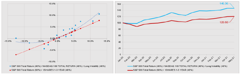
Source: Bloomberg, Convex Strategies
Our hypothetical Always Good Weather portfolio, comprised of 40% SPXT, 40% XNDX and 40% CBOE Long Vol Index (always lever the hedge), is convex to the 0.6 Beta Benchmark (60% SPXT, 40% SHY ETF). It outperforms on a compounded capital basis over time, and in particular when realizations occur in the wings of the distribution, as during the last 17 months. A clear example where more risk is less risk; protects the downside tail, participates more in the upside tail, longevity and performance in the wings.
A far more popular portfolio strategy, tailor made for the recent times of falling interest rates and central bank induced negative correlation to equities, is Risk Parity. It is, however, not convex to the 0.6 Beta Benchmark.
Figure 17: S&P Risk Parity (10Vol) vs 0.6 Beta Benchmark Jan2005-May2021

Source: Bloomberg, Convex Strategies
Figure 18: S&P Risk Parity (10Vol) vs 0.6 Beta Benchmark Jan2020-May2021

Source: Bloomberg, Convex Strategies
Yes, on an absolute return basis, Risk Parity has “outperformed” but on a visibly higher amount of risk. It is, to a significant extent, just levered 60/40 taking advantage of the golden era of central bank intervention. In our above suggested risk heuristic, shock equities down while shocking rates and volatilities higher, this will be one of the worst f(x)s imaginable. All that leverage and additional risk has gotten Risk Parity investors nothing over the return of just putting 60% into the S&P Index and 40% in cash for the last 17 months.
Instead of showing you picture after picture, we will just throw a few worked examples into a grid with some hypothetical risk and return numbers. The shading scheme is gold = neutral to 0.6 Beta Benchmark, red = concave to the benchmark, green = convex to the benchmark, white with red number = avoid under all circumstances. For those not familiar, the Dream Portfolio consists of 60% SPXT, 20% Gold, 40% CBOE Long Vol Index (always lever the hedge).
Figure 19: Risk and Return Grid Jan2005-May2021 (Yearly Rebalancing)

Source: Bloomberg, Convex Strategies
To reprise our footballing analogy, it is what happens in the two penalty boxes (the 2.5%tiles) over the course of a match that really matters, and in our view there is really no excuse to still be playing without a goalkeeper. The f(x) of the entire system is wildly unpredictable, but particularly now with what may well turn out to be unprecedentedly fat tails, both at a technical and a fundamental level. Take control of your own f(x). Go ahead and give “x” your best possible forecast, then construct your portfolio so that you make more money if you are wrong, and you make more money if you are right. Come and live in that wonderful paradise where more risk is less risk and implement your own positively convex portfolio construction.
Read our Disclaimer by clicking here