Last month we touched on how the misrepresented risk underlying short positions in GameStop led to sufficient dislocations to feed through to a correlated impact on overall equity market volatility. Interestingly, we had a similar, if seemingly unrelated, incident at February month end as the grind higher in global interest rates triggered sufficient volatility to feed through to equity market volatility. Positively correlated movements in bond and equity prices, as well as volatilities, has, as we seem to endlessly discuss, potentially dire implications for a preponderance of portfolio management strategies and is what leads us to dub “rates can’t go up” as the most commonly heard statement in market conversations.
Figure 1: VIX Index (white line RHS) vs MOVE Index (blue line LHS)

Source: Bloomberg
Term interest rates, pretty much the world over, have bounced off all-time lows, lows that were arguably induced by policy responses to the Covid Pandemic, and begun to accelerate their moves higher as market participants anticipate post-pandemic economic recoveries. Again, we discussed last month, somewhat tongue in cheek, the potential “event risk” of successful vaccination programs accentuating already building expectations of reflating economic activities. The move higher in yields eventually triggered a correlated move higher in implied swaption volatilities.
Figure 2: US 10y Interest Rate Swap Rate (white RHS) and 1y10y Swaption Implied Vol (blue LHS)

Source: Bloomberg
Back in our November 2020 Update https://convex-strategies.com/2020/12/21/risk-update-november-2020/ we had flagged the potential significance of the public tete-a-tete between the NZ Finance Ministry and the RBNZ on the inclusion of housing prices in the determination of RBNZ’s policy settings. A revival of that discussion that hit the press in the early hours of February 24th seemed to further incite the move higher in global yields and volatilities. As we often discuss, policy makers have done an extraordinary job at creating near universal acceptance that their specified measure/definition (PCE, CPI, HICP, etc) of “inflation” is the correct and only true indicator. There are fairly obvious repercussions should policy makers more widely be forced to concede that house price appreciation (along with many other items with appreciating prices/costs) need also be considered as “inflation”.
Particularly hard hit by the bond selling environment was the Australian market, despite the remaining RBA commitments to their own versions of ZIRP (Zero Interest Rate Policy), Forward Guidance (policy to remain until 2024), QE (Quantitative Easing) and YCC (Yield Curve Control). The market, seemingly, has taken an increasingly favourable view as to the success of these RBA extraordinary policy measures, and started pricing in just the sort of reflation of the economy that the measures were targeted to achieve! So how did the RBA respond to the developments of the market anticipating the successful reflation of the economy resulting from their extraordinary monetary accommodation? They accelerated their bond purchases.
This appears to be the consensus central banker view on how to deal with the apparently unexpected dilemma of their policies “working”: defending their yield target, printing more money to buy more bonds. Even as “Housing booms in Australia as prices surge most in 17 years”
https://www.bloombergquint.com/business/housing-booms-in-australia-as-prices-surge-most-in-17-years
Figure 3: AUS 10yr Swap (blue RHS) vs RBA Asset Holdings (white LHS)

Source: Bloomberg
We are very curious to see if reflation expectations, resulting from unprecedented accommodative policies, can be reversed through the use of yet more accommodative policies. We love to see central banks dancing around this sort of Catch-22 situation! The doublethink and newspeak are epic. Are they having to buy more bonds because their policies have worked, or because they haven’t worked? If their policies have worked, why are they doing more of it? If their policies haven’t worked, why are they doing more of it? In one recent discussion on the topic, the central bank sympathizers on the call were of the opinion that the market move to take rates higher was obviously pre-mature and indicative of their scepticism of the Fed’s read on the “output gap”. Anyway, they opined, the steepening of the curve was a standard early cycle return to a normally shaped curve, thus a positive sign overall. Having lost track of what passes for normal in these times, we quickly pulled up some charts to see if things were indeed repeating past behaviour.
Figure 4: US 10yr – 2yr Swap Curve Slope

Source: Bloomberg
They were right! Or were they? Sure enough, there is a very repeating pattern in the slope of the yield curve. Our chosen proxy, US 10yr swap minus US 2yr swap, shows a repeatable pattern of flattening to roughly zero, then subsequently steepening back out fairly sharply until just over 2.50% of steepness. The recent activity is very similar to that seen from mid-2000 to late 2001 and onward through 2002, as well as from late 2006 to early 2008 and onward again into early 2009. The problem, however, was the claim that this was indicative of an early cycle move towards normal times. Most will likely recall, as did we, that those periods of past steepenings did not occur during early cycle recoveries into normal times. On the contrary, they occurred in the lead up to and during what are generally considered to be market and economic busts/crises.
We drew the same picture again and added in the Fed Funds rate. Additionally, we dropped in vertical lines to mark the bottom of the flattening of the curve and then an additional line to again mark the initial sort of acceleration at the early-ish stage of the steepening.
Figure 5: US 10yr – 2yr Swap Curve Slope vs Fed Funds Rate

Source: Bloomberg
Somewhat interestingly, in June 2000, November 2006 and June 2019 the terminal flatness occurs around the end of the Fed’s previous tightening cycle. The accelerated steepening then kicks off when the Fed, responding to whatever the trigger turns out to be, commences its aggressive rate cutting cycle, ie. January 2001 (Fed cut 100bp), September 2007 (Fed cut 50bp) and March 2020 (Fed cut 150bp). None of those dates stick in our minds as “early cycle”, nor as being followed by “normalcy”.
Figure 6: SPX Index, Case Shiller Home Price Index, CPI, PCE Deflator (normalized and log)

Source: Bloomberg
We have left our vertical date lines in the above chart. Obviously, the previous two steepening cycles proceeded through significant equity market downturns, in both cases, and through a US housing price decline in the 2007-2009 period. As is generally the case, the two price indices (CPI and PCE) are seemingly only relevant to the rhetoric coming out the Fed and their gaggle of verse reciting followers, who are prime examples of Goodhart’s Law: “When a measure becomes a target, it ceases to be a good measure”. As the old saying goes, it is the same but different. The picture of the evolution of the slope of the yield curve appears to be the same from one cycle to another. However, the current phase of steepening has one clear difference. The past two steepening periods were what would be termed “bull steepening”, the curve steepened as the overall rates came down. In both the 2000-2003 and the 2006-2009 steepening periods, the 10yr swap rate dropped roughly 300bp. In the current active period of steepening it has predominantly been a “bear steepening”, with the 10yr swap rate thus far rising circa 100bp from its earlier lows. In the past steepening cycles, the bulk of the steepening occurred as the Fed worked their policy rate down to their terminal lows, 1% in 2003 and 0% in 2009, over months and years. This time around, thus far, the bulk of the steepening has occurred after the Fed has already cut to 0%. Finally, in past steepening cycles, the bulk of the steepening occurred without the Fed being active buyers of bonds through various QE programs, this time that is clearly not the case. Nobody will have to search very hard to find stories that get to the conclusion that “rates can’t go up”. The simplest explanation is that there is just too much debt in the system. By various measures Global Debt to GDP is in the region of 350% and has grown through 2020 at unprecedented rates.
Figure 7: Global Debt (US$trillion)

Source: IIF, BIS, IMF, National sources
That is very much the 36,000 feet view of why interest rates can’t go up. A more micro view comes back to our more traditional response, summed up as “the system is one big LTCM”, with levered carry everywhere. The uncapitalized tails, as ever, are the risks that will rip apart global markets as and when the next end-of-cycle risk unwind inevitably appears. As we have discussed at length over the last year, we got a good sniff of this last March when fixed income markets started to come apart, necessitating the Fed to go to “Unlimited QE” and to expand their support across a broad swath of fixed income markets.
Figure 8: US Government Debt, by Holder Category

Source: Wolfstreet.com / US Treasury
We saw figure 8 above and loved just how clearly it shows who were the liquidators of US Treasury holdings in the heat of the meltdown last March. All of the reduction in holdings came from the category “US Investors”, and we would surmise the bulk of this relates to levered holdings of those securities (aka NBFIs). The Fed stepped in to stop the landslide, back stopped all the levered players, slashed the cost of leverage, and got them all to load back up again. Almost a year later, and a potentially rational move higher in yields, supported by improving economic and pandemic dynamics, quickly becomes dysfunctional in the market. It is not that hard to guess why, and leads us back to the very same question, will more bond buying, more reflationary policies, stop the market from pricing in the reflation? No doubt we will continue to hear all sorts of demands from the market that the Fed has to increase their current $120 billion of monthly bond purchases, or has to undertake a renewed Operation Twist, or has to make permanent their SLR exemption. If it works, do more. If it doesn’t work, do more.
Unlike the purported scepticism towards theoretical estimates of the Output Gap, we suspect the market’s willingness to move rates higher, or rather lack of willingness to hold historically low yielding fixed income securities, has to do with scepticism towards the Fed’s anointed measure of inflation. As we’ve said before, it is the Keyser Söze of central bank disinformation; “The greatest trick the Devil ever pulled was convincing the world he didn’t exist”. The market has a reasonable idea what true inflation is, and the likelihood of sub-1% coupons to cover it. As we discuss over and over, inflation is in housing prices, Bitcoin, tech stocks, art, education, health care, commodities, and on and on. More worryingly, it is increasingly in food and energy. Things that are particularly large portions of consumption baskets at the lower end of the wealth spectrum.
Figure 9: UN Food and Agriculture World Food Price Index

Source: Bloomberg
Global food prices are spiking just as they did prior to the 2008 GFC and the 2011 European Credit Crisis. As if the destabilizing impact of extreme wealth segregation resulting from asset inflation isn’t bad enough, history is particularly unkind to those that can’t control food inflation. The market doesn’t want to hold fixed income securities at the all-time lows of yields because they don’t believe the central banks are truly foolish enough to believe their own propaganda that PCE Core = Inflation. Anybody in their right mind knows that the blue line in the below chart is not representative of true inflation. The market may believe that the Fed will continue to manage interest rates against their misplaced focus on PCE Core, but that will only make true inflation worse, leaving less and less appetite for holding bonds at manipulated artificially low yields.
Figure 10: US M2 Money Supply vs Copper, Corn, Shiller 20 City Home Price Index, PCE Core (normalized)

Source: Bloomberg
For simplicity and historical sake, we can use the good old Taylor Rule as some indication of just how accommodative current policy settings are. The below shows clearly why investors don’t want to hold bonds at current yields. Further central bank bond buying, as indicated by the inverted Fed balance sheet (orange line), will make the Taylor Rule rate go higher and further discourage bond ownership.
Figure 11: Fed Funds, US Taylor Rule, Fed Balance Sheet (inverted)

Source: Bloomberg
Predicting the future isn’t our thing, and instead we focus more on system fragility and robust portfolio construction. The entirety of the above discussion is indicative of some very relevant fragility, and as for portfolio construction, invariably, we are led back to the same old place: own things that participate in the upside of continued asset price inflation and own efficient asymmetric protection should the whole thing bust. Historically low yielding fixed income is unlikely to do either. We quote one of our favourite investor friends yet again “the 60/40 model is dead”. Our friend has been saying this for quite some time and based on a recent conference, two of the largest Sovereign Wealth Funds in the world now agree with him!
In the above article, the CIO of the Australian Future Fund notes that bonds have been a “gift” over the last decades as yields have steadily declined, allowing 60/40 portfolios to deliver returns that clearly cannot be replicated going forward, given where bond yields are today. Referring to that period of gifted returns, she says “but that’s over, replacing it is impossible”. We beg to differ. We would suggest the same strategy that has outperformed bonds throughout the entire “gifting” period: Convexity.
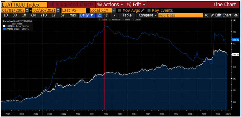
We show it over and over again in these pages. Construct better portfolio protection and take more risk. Our simple starting rule of thumb is to take whatever you have allocated to fixed income (or other supposedly defensive/diversifying strategies) and split it 50/50 between an efficient hedge and more equity beta risk. Using our usual proxies of SPXT (SnP total return index), LUATTRUU (Bloomberg Barclays US Treasury Total Return Index), and the CBOE Long Vol Index we can construct the following compounded return profiles.
Figure 12: 50/50 Barbell vs 100% US Treasury

Source: Bloomberg / Convex Strategies
The common refrain at this point is “hold on there, long volatility costs money while fixed income earns money”. You could certainly argue that looking at our fixed income and long vol components on a standalone basis over the period of peak fixed income outperformance from May 2012.
Figure 13: CBOE Long Vol Index vs US Treasury Total Return Index (red vertical = May 2012)
Source: Bloomberg
Figure 14: CBOE Long Vol Index vs US Treasury Total Return Index from May 2012

Source: Bloomberg
The correct way to look at it, we believe, is how much opportunity cost is there to withhold allocation to your growth asset versus the true portfolio protection you are getting from your defensive allocation. Going back to our oft used football/soccer analogy, a defensive midfielder might score more goals than a good goalkeeper, but it does not do nearly as good a job at defending the goal and won’t let you put more goal scorers on the pitch! Thus, even choosing May 2012 as our start date, we still get the same result from our 50/50 rule of thumb replacement.
Figure 15: 50/50 Barbell vs 100% US Treasury since May 2012

Source: Bloomberg / Convex Strategies
Taking a couple of mediocre goal scoring, unreliable defending, expensive defensive midfielders off the pitch and replacing them with an effective goalkeeper and a cost-efficient striker appears to be a superior solution. In the world of compounding returns it is even better because goals against count more than goals scored (the math of compounding!). Another amazing benefit in the world of portfolio management, you can hire more than one goalkeeper, without having to take other players off the pitch (this is why we also say to 2x lever the hedge), thus allowing even more aggressive allocation to skilled, but low cost, strikers. So, on this principle, we can reconstruct the, now considered to be dead, 60/40 balanced portfolio into the rule of thumb based 80/20 barbell, and further with 2x levered hedge to an 80/40 barbell, and yet further with more aggressive strikers (call them Nasdaq) due to the 2x hedge to what we like to a call an Always Good Weather portfolio of 40/40/40.
Figure 16: 80/20 Barbell vs 60/40 Balanced

Source: Bloomberg / Convex Strategies
Figure 17: 80/40 Barbell vs 60/40 Balanced

Source: Bloomberg / Convex Strategies
Figure 18: 40/40/40 Always Good Weather vs 60/40 Balanced

Source: Bloomberg / Convex Strategies
There you have it! Even during the “gifted” period for fixed income and its undeniable contribution to balanced portfolios, you would have been much better off adding convexity to your portfolio. It seems pretty obvious to us what is the answer to the dilemma posed by today’s starting point of nearly non-existent yields, now that the gift has already been delivered.
One final visual. Many will be familiar with our discussions of the Hypothetical Concave and Convex portfolios, eg in our July 2020 Update https://convex-strategies.com/2020/08/27/risk-update-july-2020/.
Figure 19: Hypothetical Concave and Convex vs 60% Benchmark Scattergram View

Source: Bloomberg / Convex Strategies
Figure 20: Hypothetical Concave and Convex vs 60% Beta Benchmark Compounded

Source: Bloomberg / Convex Strategies
To show that our example of the Hypothetical Convex portfolio isn’t just the realm of fantasy and unicorns, we can fire up our own Scattergram toy and load up the Always Good Weather portfolio against the 60/40 Balanced.
Figure 21: Always Good Weather 40/40/40 vs Balanced 60/40 Scattergram View Jan20-Feb21

Source: Bloomberg / Convex Strategies
Figure 22: Always Good Weather 40/40/40 vs Balanced 60/40 Compounded Jan20-Feb21

Source: Bloomberg / Convex Strategies
It can be done! Of course, finding real world examples of the Hypothetical Concave portfolio is much much easier.
Figure 23: Always Good Weather 40/40/40 vs Hedge Fund Index Scattergram View Jan20-Feb21

Source: Bloomberg / Convex Strategies
Figure 24: Always Good Weather 40/40/40 vs Hedge Fund Index Compounded Jan20-Feb21

Source: Bloomberg / Convex Strategies
Cutting and pasting from the July 2020 Update:
Compounding is driven by performance in the wings. What drives the above sort of implied compounding destruction?
- Fees and expenses. Costs in general, but particularly fees that are linked to correlated returns. Paying away 10-20% of the upside returns of correlated risks, but keeping 100% of the losses, is a sure way to impair compounding.
- Investment exposures with bounded, seemingly uncorrelated, upside, but unbounded correlated downside, eg carry trades, short volatility, levered low vol type strategies. It is easy enough to picture the orange dots in Figure 8 as approximating the payout of a short put option, that now infamous analogy of Hedge Fund performance net of fees.
- Short term return objectives. The incentivized targeting of probabilistic “expected returns”, as opposed to long term compounded returns, creates a focus on performance at the centre of the probability distribution, not the wings.
- Pro-cyclical Gaussian based risk methodologies, eg. Value-at-Risk type constructs that encourage risk taking when valuations are high, and vice versa. Think of it as negative gamma risk management, buy high and sell low.
There are solutions to all of these problems. The first step is deciding that the ultimate objective in managing investment capital is geometric compounding. With that in mind, the failings of the above compounding destroyers stand out like the proverbial sore thumb. As we forever say, from there it is just math.
Read our Disclaimer by clicking here